
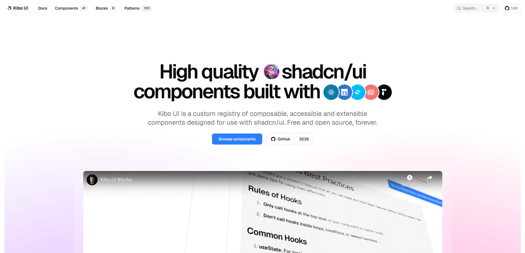
Kibo UI
Kibo UI adalah registri khusus komponen React yang dapat dikomposisi, dapat diakses, dan sumber terbuka yang dibangun di atas shadcn/ui yang menyediakan komponen UI canggih seperti bagan Gantt, papan Kanban, kanvas kolaboratif, dan primitif obrolan AI untuk membantu pengembang membangun antarmuka yang lebih kaya lebih cepat.
https://www.kibo-ui.com/?ref=producthunt&utm_source=aipure
Informasi Produk
Diperbarui:Nov 8, 2025
Apa itu Kibo UI
Kibo UI memperluas filosofi shadcn/ui dengan menyediakan pustaka lengkap komponen siap produksi dan dapat diakses yang menangani pola UI yang kompleks. Sementara shadcn/ui berfokus pada primitif dasar dari Radix UI, Kibo UI menawarkan komponen yang lebih canggih dengan fungsionalitas terintegrasi seperti unggahan file seret dan lepas, antarmuka pencarian lanjutan, dan validasi formulir yang kompleks. Dibangun dengan Next.js, TypeScript, Tailwind CSS, dan primitif Radix UI, ia mengikuti prinsip kompositabilitas dan tema variabel CSS yang sama yang membuatnya terintegrasi dengan mulus dengan proyek shadcn/ui yang ada.
Fitur Utama Kibo UI
Kibo UI adalah registri khusus dari komponen yang dapat disusun, mudah diakses, dan sumber terbuka yang dirancang khusus untuk digunakan dengan shadcn/ui. Ini memperluas primitif dasar shadcn/ui dengan komponen tingkat aplikasi yang lebih kompleks seperti bagan Gantt, papan Kanban, pemilih warna, dan chatbot AI. Pustaka ini menawarkan lebih dari 40 komponen tingkat lanjut, 6 blok bawaan, dan 1000+ pola yang sepenuhnya dapat disesuaikan, mudah diakses, dan terintegrasi dengan mulus dengan proyek shadcn/ui yang ada menggunakan variabel CSS.
Pustaka Komponen Tingkat Lanjut: Menyediakan komponen canggih di luar primitif dasar, termasuk bagan Gantt, papan Kanban, editor teks kaya, pemilih warna, dan kanvas kolaboratif dengan fitur waktu nyata
Integrasi Mulus: Bekerja sempurna dengan proyek shadcn/ui yang ada melalui variabel CSS dan dapat diinstal dengan cepat menggunakan Kibo UI atau shadcn CLI
Aksesibilitas dan Komposabilitas: Semua komponen dibuat dengan mempertimbangkan aksesibilitas (sesuai dengan WCAG) dan sepenuhnya dapat disusun, memungkinkan pengembang untuk menyesuaikan dan memperluasnya untuk kebutuhan spesifik
Blok dan Pola Bawaan: Mencakup blok siap pakai seperti chatbot AI, formulir, dan halaman harga, ditambah lebih dari 1000 pola untuk mempercepat pengembangan
Kasus Penggunaan Kibo UI
Pengembangan Dasbor Perusahaan: Bangun antarmuka administratif yang kompleks dengan tabel data, bagan Gantt, dan papan Kanban untuk manajemen proyek dan kolaborasi tim
Aplikasi Bertenaga AI: Implementasikan fitur AI menggunakan antarmuka chatbot bawaan dan komponen input tingkat lanjut yang dirancang untuk interaksi AI
Pembuatan Sistem Desain: Buat sistem desain komprehensif dengan komponen yang konsisten, mudah diakses, dan dapat disesuaikan yang berfungsi di berbagai proyek
Alat Kolaboratif: Kembangkan fitur kolaboratif waktu nyata menggunakan komponen seperti kanvas kolaboratif dan kemampuan pengeditan multi-pengguna
Kelebihan
Memperluas shadcn/ui dengan komponen kompleks siap produksi
Sumber terbuka dan gratis untuk digunakan selamanya
Fokus kuat pada aksesibilitas dan penyesuaian
Pengaturan cepat dan integrasi mulus dengan proyek yang ada
Kekurangan
Memerlukan pengaturan shadcn/ui yang ada dengan Variabel CSS
Beberapa komponen mungkin dianggap relatif baru/eksperimental
Ketergantungan pada berbagai teknologi dapat meningkatkan ukuran bundel
Cara Menggunakan Kibo UI
Instal Prasyarat: Pastikan Anda telah menginstal shadcn/ui dan Tailwind CSS di proyek Anda. Pengaturan shadcn/ui Anda harus menggunakan versi Variabel CSS (ini adalah default).
Instal Kibo UI: Instal komponen Kibo UI menggunakan Kibo-UI CLI atau shadcn CLI. Jalankan: 'npx kibo-ui@latest add <nama-komponen>' (misalnya 'npx kibo-ui@latest add gantt')
Impor Komponen: Impor komponen Kibo UI yang diinginkan dari direktori komponen Anda. Contohnya: 'import { Announcement, AnnouncementTag, AnnouncementTitle } from '@/components/ui/kibo-ui/announcement''
Gunakan Komponen: Gunakan komponen yang diimpor dalam kode JSX/TSX Anda. Komponen dapat dikomposisikan dan disesuaikan menggunakan properti dan kelas Tailwind CSS.
Gaya Komponen: Sesuaikan komponen menggunakan variabel CSS shadcn/ui dan utilitas Tailwind CSS. Komponen menggunakan sistem tema yang sama dengan shadcn/ui.
Perluas Komponen: Komponen dapat diperluas dengan fungsionalitas tambahan karena mereka menerima atribut HTML primitif. Misalnya, AnnouncementTag memperluas HTMLAttributes<HTMLDivElement>.
Gabungkan dengan shadcn/ui: Campur dan cocokkan komponen Kibo UI dengan komponen inti shadcn/ui untuk membuat antarmuka pengguna yang kaya dan dinamis.
Tambahkan Lebih Banyak Komponen: Instal komponen tambahan sesuai kebutuhan menggunakan CLI. Komponen ditambahkan sesuai permintaan untuk menjaga aplikasi Anda tetap ramping dan hanya menyertakan kode untuk fitur yang Anda gunakan.
FAQ Kibo UI
Kibo UI adalah registri khusus komponen yang dapat dikomposisi, diakses, dan diperluas yang dirancang untuk digunakan dengan shadcn/ui. Ini gratis dan sumber terbuka, menyediakan komponen kompleks tambahan yang melampaui primitif inti shadcn/ui.
Artikel Populer

Atoms: Platform AI Multi-Agen yang Mengubah Ide menjadi Produk Siap Diluncurkan
May 22, 2026

Nano Banana SBTI: Apa Itu, Bagaimana Cara Kerjanya, dan Cara Menggunakannya di Tahun 2026
Apr 15, 2026

Ulasan Atoms — Pembuat Produk AI yang Mendefinisikan Ulang Kreasi Digital di Tahun 2026
Apr 10, 2026

Kilo Claw: Cara Menerapkan dan Menggunakan Agen AI "Lakukan-Untuk-Anda" Sejati (Pembaruan 2026)
Apr 3, 2026
Alat AI Terbaru Serupa dengan Kibo UI

Hapticlabs
Hapticlabs adalah toolkit tanpa kode yang memungkinkan desainer, pengembang, dan peneliti untuk dengan mudah merancang, membuat prototipe, dan menerapkan interaksi haptik yang imersif di berbagai perangkat tanpa pemrograman.

Monyble
Monyble adalah platform AI tanpa kode yang memungkinkan pengguna untuk meluncurkan alat dan proyek AI dalam 60 detik tanpa memerlukan keahlian teknis.

Abyss
Abyss adalah platform bertenaga AI yang memungkinkan pengguna untuk membuat, berbagi, dan menjalankan Widget spesifik tugas otomatis tanpa memerlukan keahlian teknis.

AppScape
AppScape adalah platform tanpa kode yang menawarkan aplikasi siap pakai bertenaga AI dan solusi SaaS yang dapat disesuaikan, memungkinkan penerapan cepat tanpa biaya pengembangan tradisional dan keahlian teknis.
Alat AI Populer Seperti Kibo UI

GitHub MCP Server
GitHub MCP Server adalah server Model Context Protocol yang memungkinkan integrasi tanpa batas antara model AI dan API GitHub, menyediakan alat standar untuk pengelolaan repositori, pelacakan masalah, dan operasi kode.

GoCodeo SaaS Builder
GoCodeo SaaS Builder adalah kerangka kerja asli AI yang secara otomatis menghasilkan aplikasi SaaS full-stack siap produksi menggunakan agen AI otonom, lengkap dengan autentikasi, fitur real-time, dan integrasi TypeScript.

iBrowsy
iBrowsy adalah peramban web modern bertenaga AI untuk macOS yang menggabungkan fitur cerdas, desain yang mengutamakan privasi, dan pengalaman pengguna yang mulus dengan bantuan GPT-4 bawaan.

VibeSDK by CloudFlare
VibeSDK adalah platform bertenaga AI open-source oleh Cloudflare yang memungkinkan pengembang untuk menerapkan lingkungan pengkodean vibe full-stack mereka sendiri dengan satu klik, memungkinkan pengguna untuk menghasilkan dan menerapkan aplikasi melalui deskripsi bahasa alami.